
Imagine our earth a giant color wheel
each of us a gorgeous dot of pigment
equal reds, equal greens, all colors equal
but we humans don’t think in terms of equal
quite as much as we should
we are alike
but ‘enjoy’ thinking otherwise
we tend to shove one another around
crash head to head
we cancel each other out
and become void
we choose to destroy our brilliance
yet
if we agreed
equal to be equal
equal reds, equal greens
if we learned to stand
side by side
what beauty there would be
on the color wheel they call this complimenting
on the earth we’d call it peace
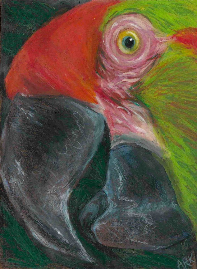 I can’t think of a more beautiful, earthly color coexistent than a parrot
parrot in Prisma pencil done around 2002
opposing colors on the color wheel are called complimentary because when placed side by side they brighten, when these same colors are mixed in equal measure, they create a neutral or gray

A well-expressed truth.
LikeLiked by 2 people
I woke this morning with this thought in my head.
Thank you, Stuart.
am:)
LikeLike
so true
LikeLiked by 1 person
Beautiful drawing and beautiful writing as always AnnMarie! Keep up the good work!
LikeLiked by 1 person
Thank you, Dan.
Hope you’re feeling well today:)
LikeLiked by 1 person
Thanks AnnMarie. I need to work on getting more sleep but I have exciting news as I have returned to writing books instead of short stories. My current book is dedicated to Wes Craven and Christopher Lee. I thought my scary story writing days were over but once Wes Craven died I had to comeback. One of the characters is named Craven and another character named after Christopher Lee. Fitting tributes. So far the book is scary as hell so ,so far so good haha. Hope you are having a good weekend!
LikeLike
Scary never goes out of style:)
I’m enjoying the time off, thank you.
LikeLiked by 1 person
Your welcome glad you are having a good weekend. Yea I am so happy I know who the killer will be in the book and I am adding in a friend of friend so she will feel special too. I have been giving the end a lot of thought I had one ending that was great but then I changed my mind. I think when I get to the ending it will come to me. I love these kind of horror stories and I have seen so many horror movies I know how to send the readers out the right way. I love the battle between Good and Evil in horror movies and horror stories. My horror book will deff scare a lot of people and make Wes Craven proud.
LikeLike
Sounds terrific. I’m sure Mr. Craven is smiling from above:)
LikeLiked by 1 person
Yea I am sure he loved that I named a character after him. Yea I will deliver big time in this book for myself and Mr. Craven.There are Legends and There are Icons and there is AnnMarie. AnnMarie=The Greatest Ever.
LikeLike
I’m sure he’s loving your book from Halloween Heaven:)
LikeLiked by 1 person
I hope I get to go to Halloween Heaven one day. All my heroes are there Donald Pleasence, Christopher Lee and Peter Cushing and Vincent Price.
LikeLike
🙂 You go there. I’m going to the big white kitchen where the card game, pasta and wine will be;)
LikeLiked by 1 person
I’ll be sure to come visit that heaven too I love Pasta and I love The AnnMarie.
LikeLike
😉
LikeLiked by 1 person
An old song, but worth remembering, “Red and yellow, black and white, they are precious in His sight…” – Fawn
LikeLike
I don’t remember, but I’m sure it was sung out somewhere in Assumption school:)
Happy Weekend, Fawn.
am:)
LikeLike
i loved this
both the artwork and message
LikeLike
Thank you, kindly.
annmarie:)
LikeLiked by 1 person
love the parrot !!
LikeLike
Thank you, Gwennie.
annmarie:)
LikeLike
This is a beautifully-rendered parrot (again, those darn eyes — or rather in this case, “eye”). Such a beautiful extended metaphor that paints the truth of the matter in subtle but masterfully-controlled strokes — what we’re seeing here is an artist painting with words. And many thanks for explaining complimentary colors — which I never did understand until now (such a perfect, perfect metaphor all-around, in all its depths). All lines wonderful of course, but those last two — pure frisson.
LikeLike
When it comes to fur, feathers and all that good stuff – I’m not a detail person and don’t enjoy doing realistic detail – I focus on the eyes because they are so very meaningful and bring more (I hope) to the personality than a silky coat:)
Thank you for your superbly generous comment – wow! 🙂 And you’ve chosen a word from my, favorite word list,”frisson” – it’s on my list not only for meaning – it reminds me of the friesian – an absolutely gorgeous, ivory blue-black breathtaking horse – my favorite:)
Enjoy the day:)
LikeLike
I understand the “detail” aesthetic completely, feel that way about writing/description. Why the “wowzer,” Miss? I’m just telling the truth. Friesians are beautiful animals indeed.
LikeLike
hanging out in the details – way too devilish;)
LikeLiked by 1 person
Excellent…all the way around.
LikeLike
Well, thank you:)
LikeLike
I love the sentiment behind this, very though provoking. The parrot looks amazing too.
LikeLike
I thank you.
annmarie:)
LikeLike
I love this! Words and drawing. I especially like the word “brilliance” here — as in color brilliance and also intelligence or lack there of. I have a color wheel illustration that sits in the bottom of my knitting basket — and I do refer to it when choosing colors for projects. The idea of brilliance coming from different colors complimenting each other — in art — as peace in the world. Juxtapose this to that wonderful song Ebony and Ivory — probably not the name of it…..but I like your idea much better. So many hues in the world. Smiling I am, over my second cup!
LikeLike
Coffee sipping and smiling, two of my morning pleasures:)
I woke the other morning and this was in my head. I’m quite sure it sprung forth from teaching about the basic elements of art this past week. Thank you for you kind words here, Lillian.
am:)
LikeLiked by 1 person
You paint a beautiful and colorful picture of the world.
LikeLike
Wouldn’t it be lovely though – if we all liked one another:)
LikeLiked by 1 person
No doubt!
LikeLike
🙂
LikeLike
O, my friend, this is heartbreakingly beautiful and all very, very true! I absolutely loved the ending, or better I choose it and I hope it to be a beginning: “on the color wheel they call this complimenting
on the earth we’d call it peace”! ❤
LikeLike
Thank you, my artful friend:)
LikeLiked by 1 person
You are most welcome, AnnMarie and Thank You! ❤
LikeLike
🙂
LikeLiked by 1 person
Beautiful poem and art. Lovely message. You might consider sending this one in to Artists4Peace 🙂
LikeLike
Thank you, Melanie.
You know, I think I sent this one – now I can’t remember. I’ll have to check.
Thank you though, for suggesting.
annmarie:)
LikeLike